Variations on a Theme: Processing Sketches
For my first post on my new blog I thought I’d share some of the ideas I’ve been playing with for a while. All of these images were created using Processing and use Perlin noise to generate random but organic looking movement.
The first set of sketches use just four variables, which can be used in various combinations to generate coordinates, which can be joined by lines of two different colours.
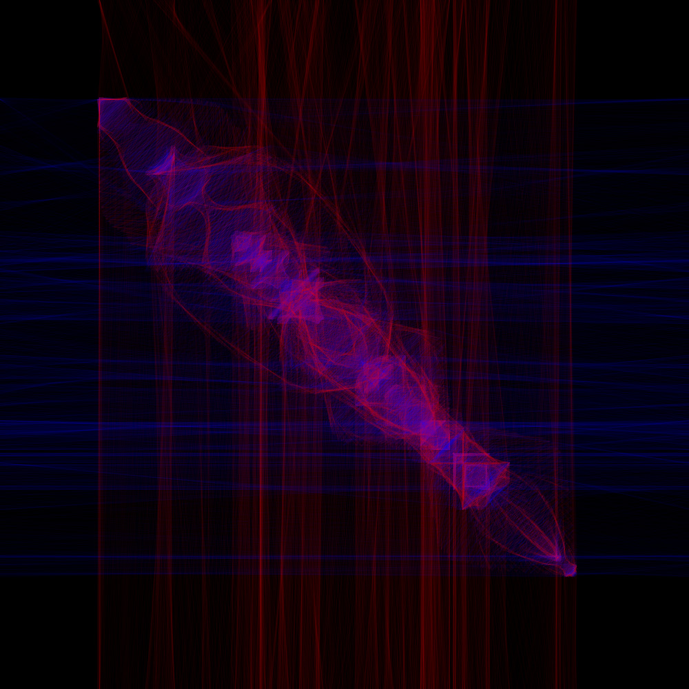
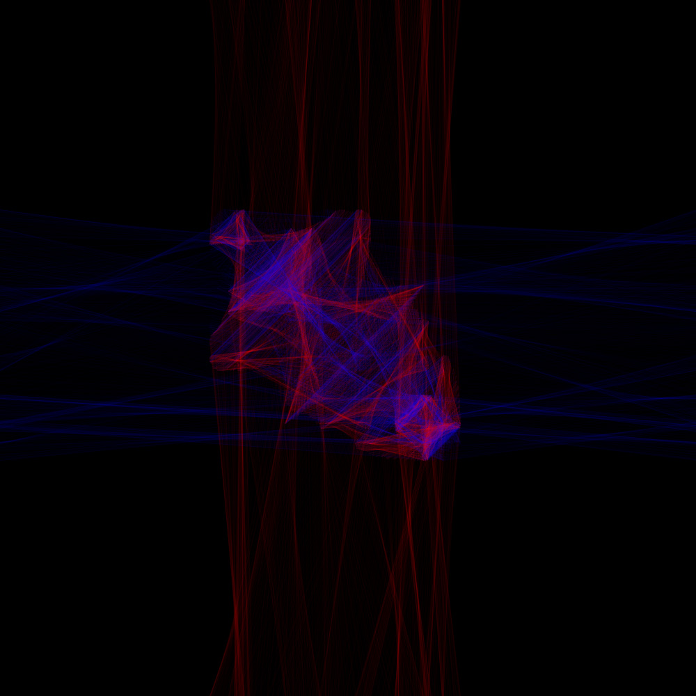
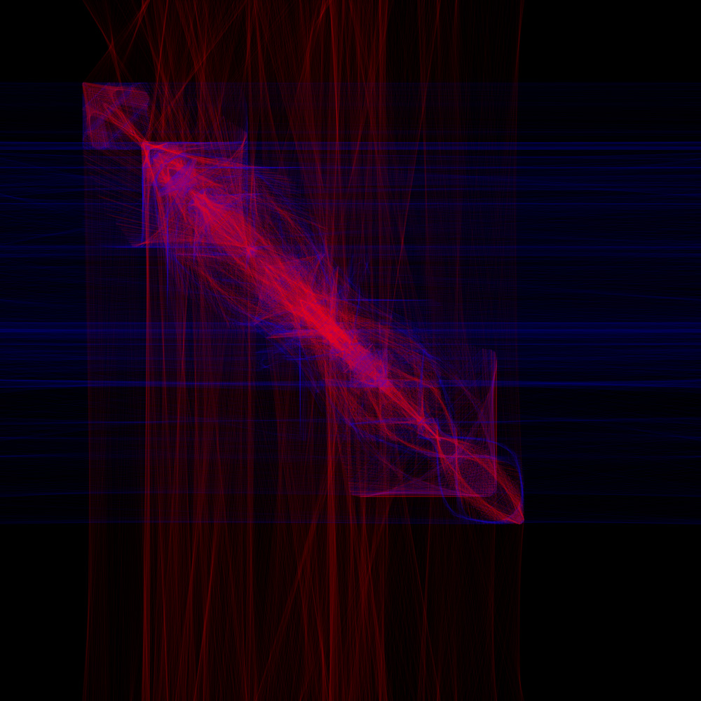
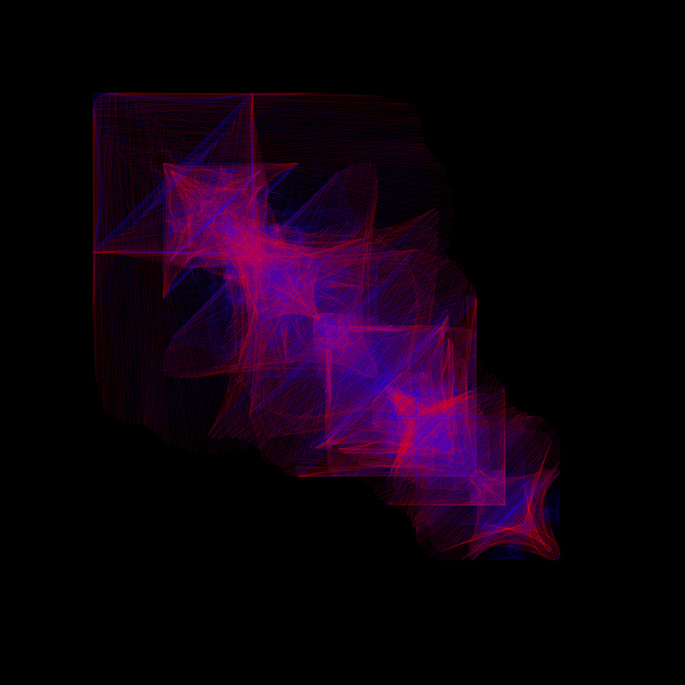
This was a fairly straight forward bit of coding, with some pleasingly elegant results. Click on the pictures above for more and bigger images, or check it out in real time at OpenProcessing.
The next step was to add the points into an array so they could be manipulated more easily. I did this as a step to getting this idea to work in 3d, but it also lets you do some things in 2d that would be difficult otherwise, like joining the edges together.
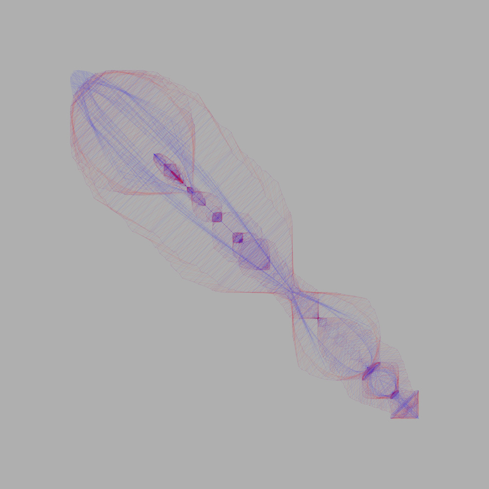
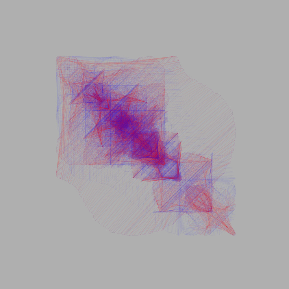
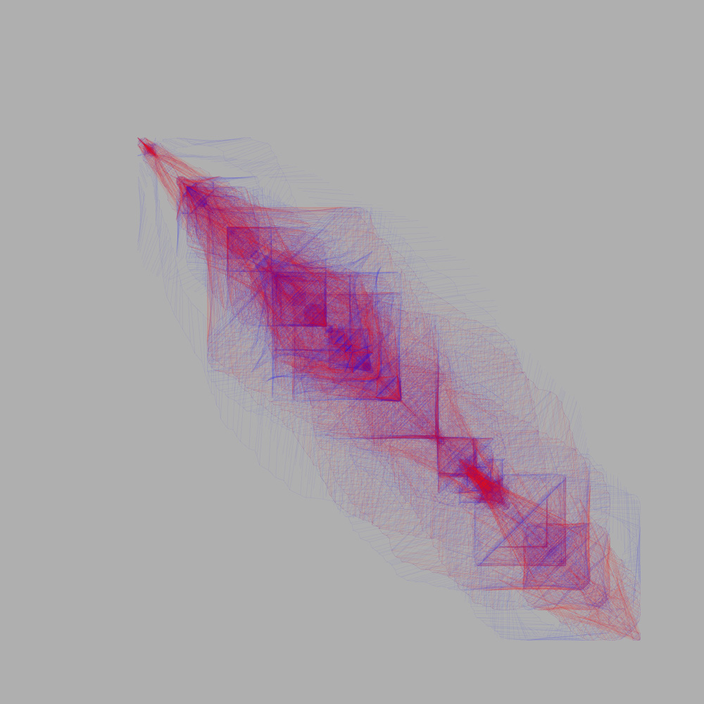
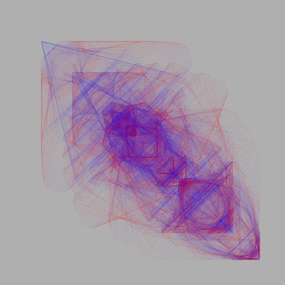
The downside of this method is that it doesn’t run that well when there’s loads of points on screen (we’re talking about upwards of 20,000 lines on screen at times, unless my maths is wildly off). Using the OpenGL renderer helps but isn’t supported by OpenProcessing. Have a look at the live sketch, and again, there’s more and bigger pics if you click on the pictures above.
The next step was to make it 3d. This proved to be far simpler than I expected; it was just a case of adding an extra set of variables for the z-axis coordinates. This was also aided greatly by my discovery of the fantastic PeasyCam library for Processing. This lets you use the mouse to control the camera in a very intuitive way.
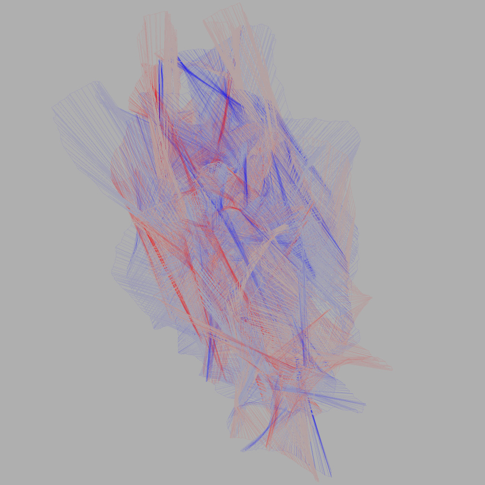
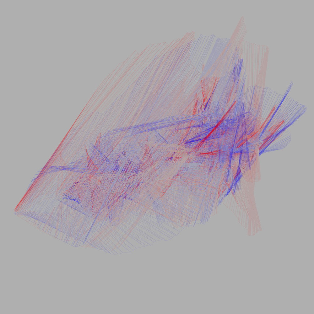
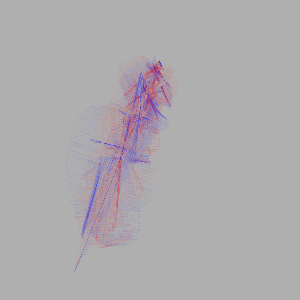
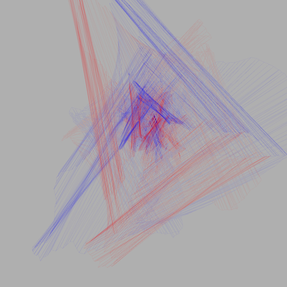
Check out the rest of the set on Flickr, and have a shot of the live applet here. It runs surprisingly smoothly with Processing’s default 3d rendering, and it’s worth trying just to see how effortless the PeasyCam is in use- highly recommended!
The latest iteration of this principle is to use the points generated as vertices of a solid shape rather than just lines. In theory, this lets you do stuff like [this amazing bit of 3d printing][19] from Toxi. In practice, this is more like planes than solids at the moment. I added an extra colour for variety here, just for fun.
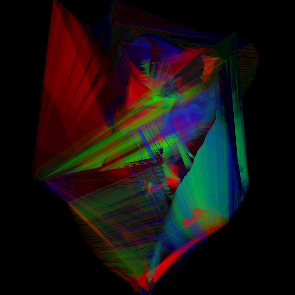
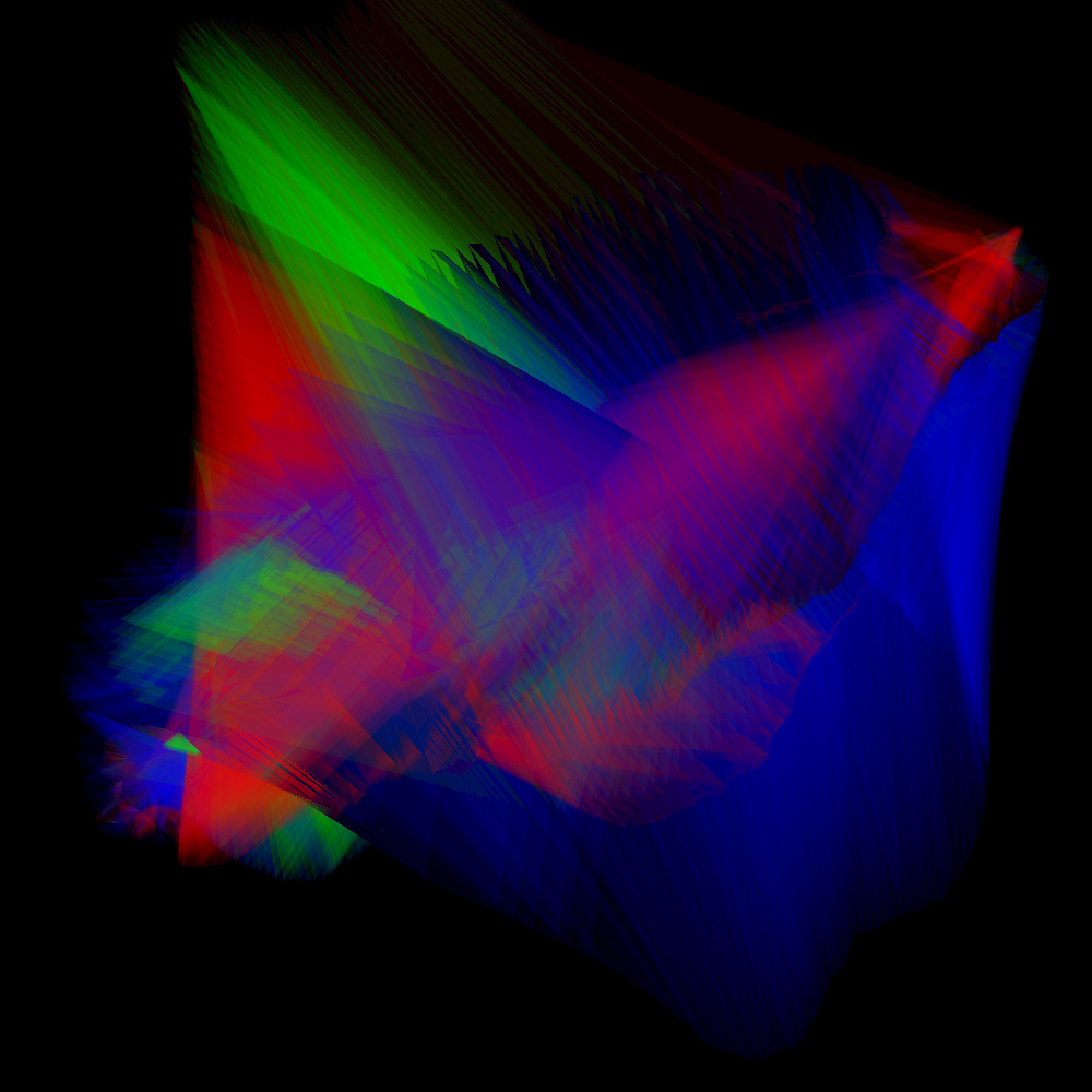
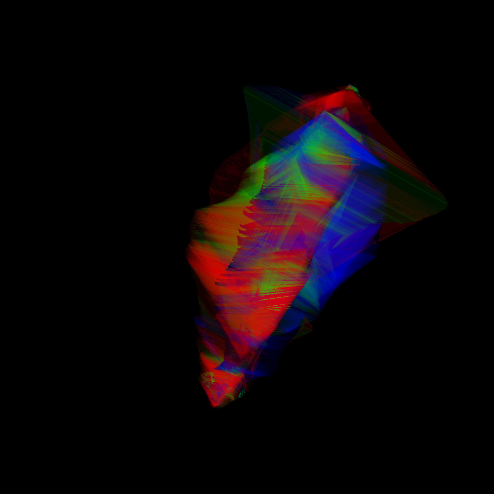
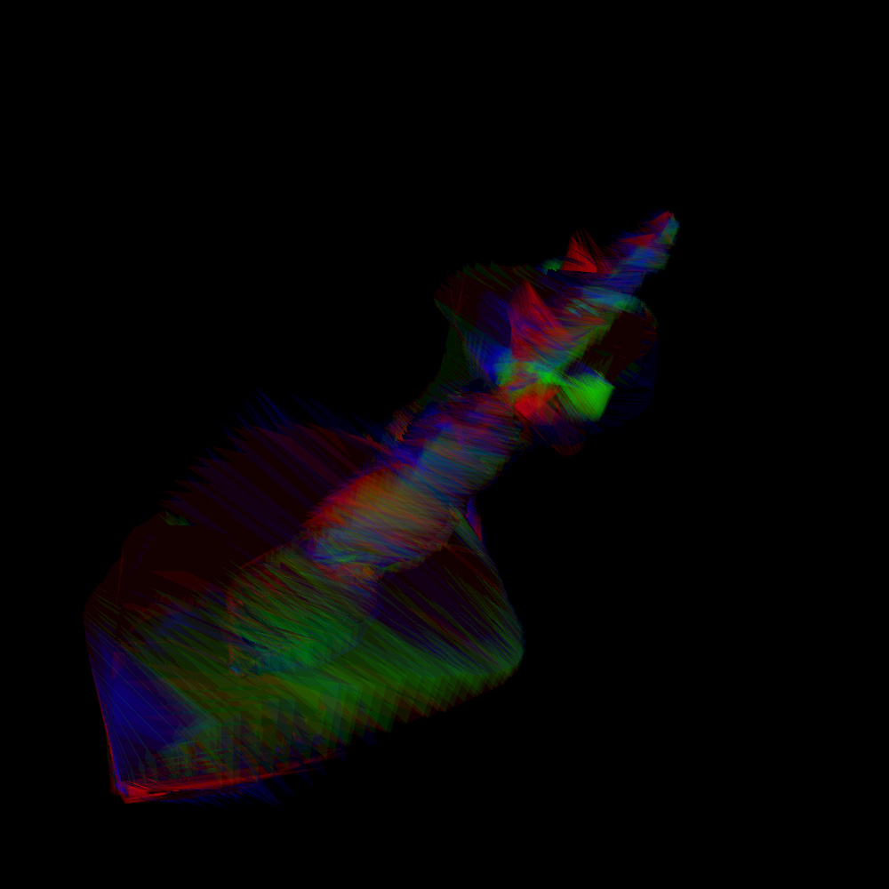
I was originally hoping to retain the symmetry of the 2d versions in 3d, but I’m not quite sure how to achieve that yet. I’ve not published this sketch online as it runs pretty badly without OpenGL enabled, although it works well on my machine. Have a look at the pics anyway, and feel free to get in touch if you’re interested in the code (although it’s nothing remarkable!).
No doubt I’ll keep playing with these ideas, so watch this space for more updates.