New Designers pro-tips
A couple of months ago me and Alistair went to see the second part of New Designers 2013. We visited the DJCAD Social Digital (a combination of Digital Interaction Design and Product Design) stand, congratulated the class of 2013 on their three award nominations and two wins from over 1400 exhibitors, then we moved on to have a look round the rest of the cavernous show floor. And that’s when I started getting irate.
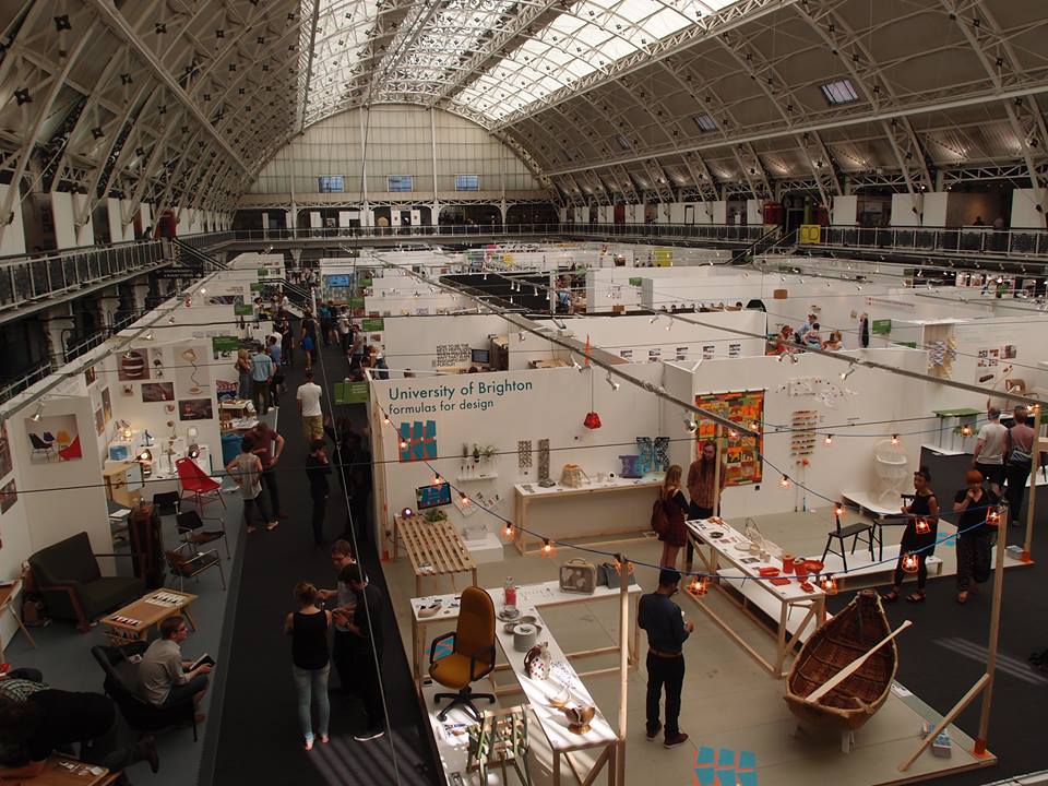 *The
New Designers show floor from above. Photo by Rachael Johnston.*The
quality of actual work on show was, for the most part, thoroughly
excellent. As we made our way through the show, though, we saw a few
mistakes in how people presented their work occur time after time -
mistakes that led to a lot of good work not being shown to best effect,
and mistakes that could and should have been avoided. Without further
ado…
*The
New Designers show floor from above. Photo by Rachael Johnston.*The
quality of actual work on show was, for the most part, thoroughly
excellent. As we made our way through the show, though, we saw a few
mistakes in how people presented their work occur time after time -
mistakes that led to a lot of good work not being shown to best effect,
and mistakes that could and should have been avoided. Without further
ado…
Don’t make me work to find out what your design is
I’m going to give two specific examples: both notable for being good ideas totally undersold.
- One of the first stalls we visited featured a chap who designed and built his own open-source Arduino-powered CNC router from commodity parts for under £500. It’s an amazing piece of engineering ingenuity. Unfortunately, nowhere on the stand did it explain what the piece actually was. The guy had to come over and tell us what he’d made. There were some boards up with some overarching conceptual thinking about open source fabrication, but nothing about the specific items on display.
- Another guy had designed a triangular bottle for soft drinks. He had three A3 boards of ergonomic studies, fancy renderings with famous labels, diagrams showing how they would stack more easily than round bottles, etc. Unfortunately, it wasn’t til halfway down the third board that he got to the actual point of the design: that they could be easily used for building houses in the global South rather than being recycled conventionally. Once again, the designer had to come and tell us about it.
Time after time, the lede was buried in pages of impenetrable jargon. This was such a pattern that after the first few stalls, I started skipping to the last paragraph of every text I read. Depressingly enough, it worked.
Let me be blunt: if you have to come and explain your product to me, you might as well not bother. If I have to read three pages of conceptual justification before you get to the point, well, I’m probably not going to. You want to grab someone’s attention so that they know what you’ve done, and they want to find out more, and then you can start on the conceptual stuff. Do it the other way round, and 90% of people are going to bounce straight off and move on to the Robocop-styled golf caddy at the next stall; they might not give a shit about golf, but they can see what it is and they don’t have to read 500 words of art school nonsense to get a better idea of it.
I guess this is a side effect of design and technology courses coming out of art school environments, as opposed to engineering departments (who I imagine would veer too far in the opposite direction), but this is not your degree show, or your thesis defence. If there’s one thing I’ve learned from Mike Monteiro, it’s that design is about selling your work- and yourself- to clients, to tutors, or in this case, to New Designers attendees who may or may not want to employ someone with your particular skill set. Do you really want to lose that opportunity because you took too long to get to the fucking point?
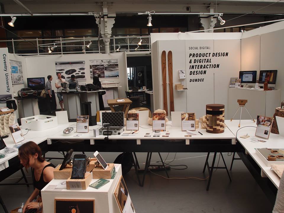 The (rather good) Social Digital stand at ND 2013. Photo by Rachael Johnston.
Spell check your shit
In an age where almost every interaction with your phone, never mind your computer, results in a squiggly red underline whenever you cock something up, it is an unforgivable sin to have spelling mistakes in your promotional material. First impressions count, and if the first thing I notice is that you’ve fucked up something as basic as the spelling on your pitch to the world, that doesn’t exactly bode well. Get someone else to look over it before printing it out. It’s OK if English isn’t your first language- we should all be doing this. Offer to read over your classmates’ material. You’re not being a dick by pointing out mistakes, you’re helping them make their work better. Which means they’re more likely to help make your work better. Everybody wins.
Design your presence
So what’s to be done? Well, it’s called New Designers for a reason. Use the skills that are going to get you there on how you present yourself and your work, as well as on the work itself. As designers we solve problems and make peoples’ lives easier: how can you make it easier for people to understand what your showing them?
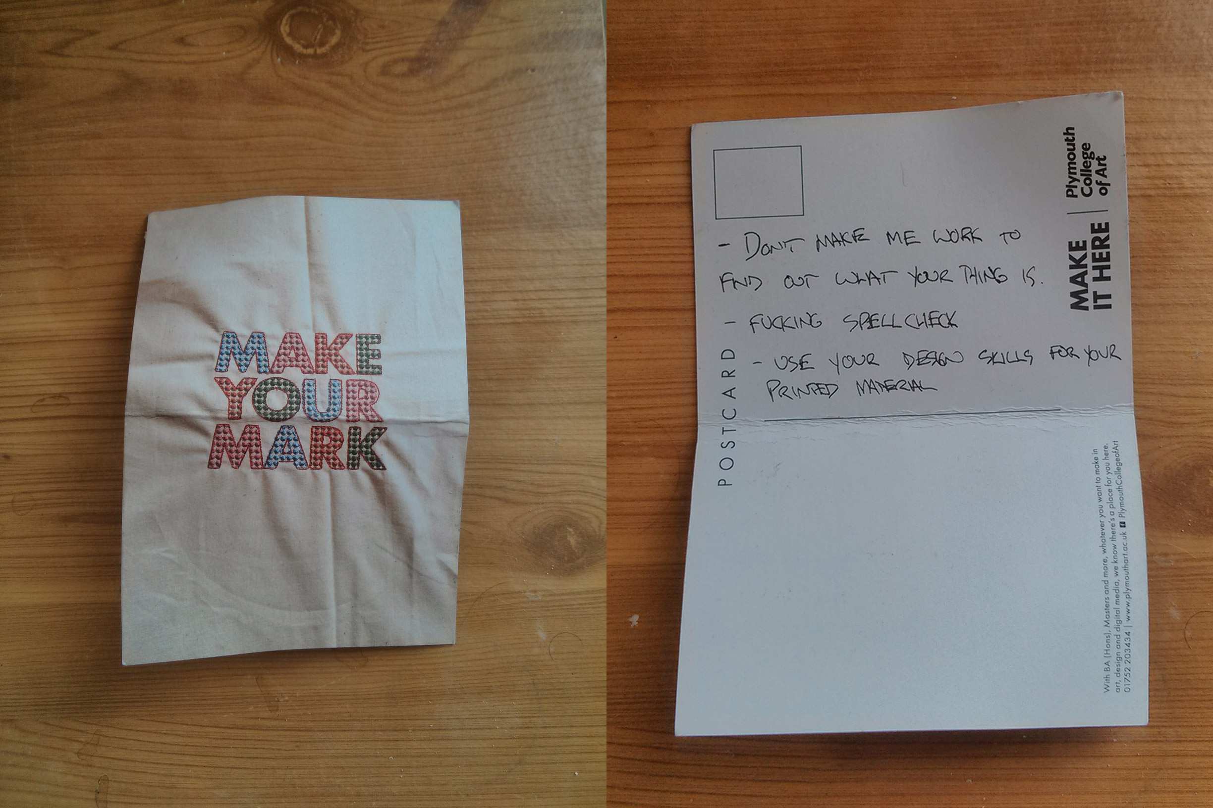 The first draft of this post, sketched in the pub after visiting New Designers. With apologies to Plymouth College of Art.
Postscript
I don’t think I have any special insight here, although as an Interaction Design student I do think a lot about how people, uh, interact with stuff. So maybe that helps. Regardless, the real reason I’ve written this is to try and articulate the issues we came across, so that we can do better next time.
Although the rage helped.
Anyway, I hope to be at New Designers 2014 as an exhibitor, so come and hold my words against me. If you can’t tell what I’ve designed within twenty seconds, you can come and give me a good telling off. And if you spot a typo in my blurb, well, I’ll accept a swift kick to the shin.
Bring it on.
Post-postscript
I wrote this post in the immediate aftermath of our visit, but haven’t gotten around to posting it until now for various reasons I won’t bore you with.
We had a meeting last week with our lecturer who said much the same things, but slightly more politely, so I don’t think I’m totally off the rails with this. Feel free to comment or tweet me @k_macquarrie if you disagree.